Nike
Unite
Introduction
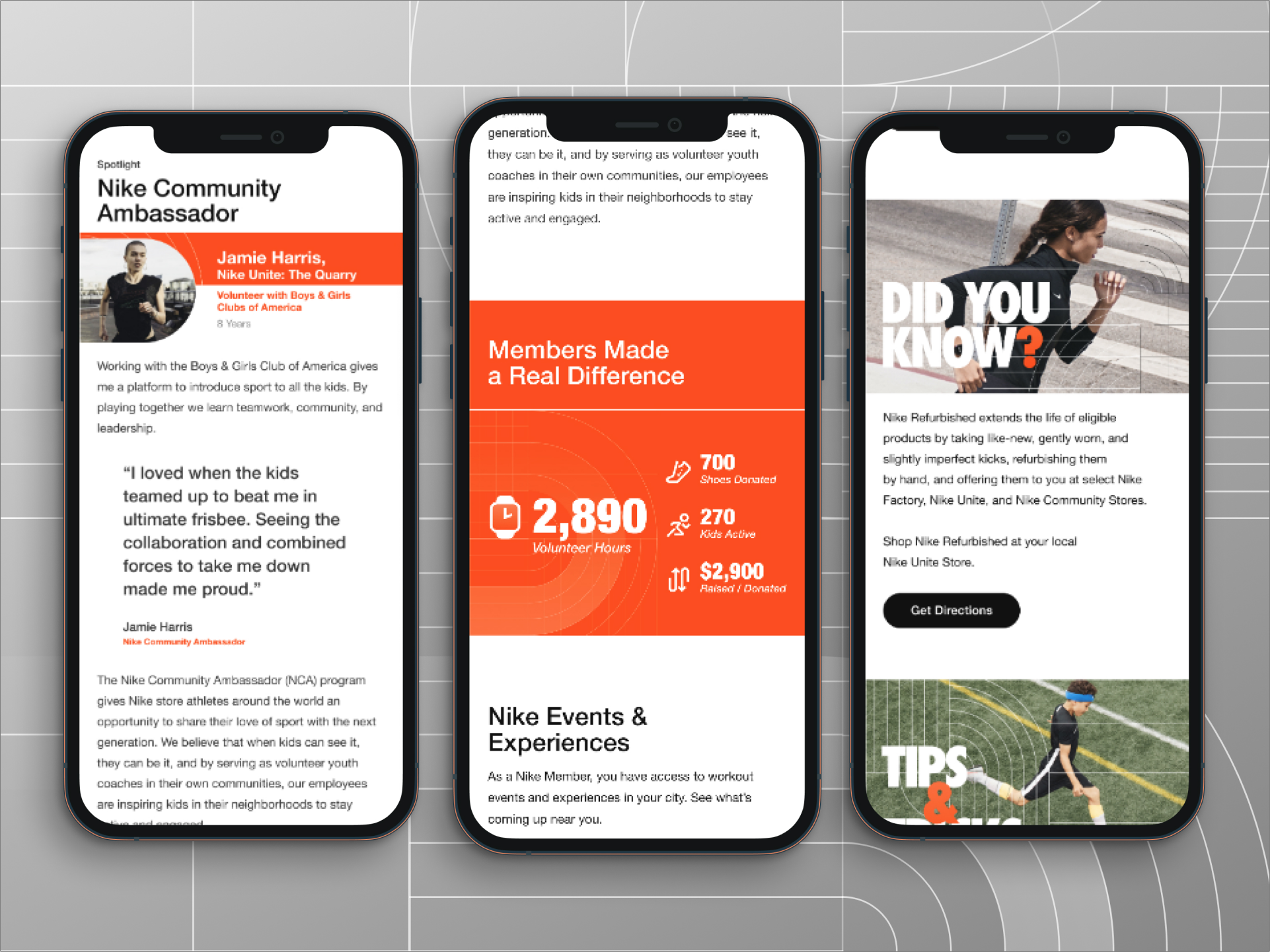
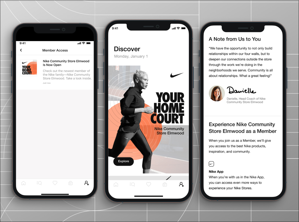
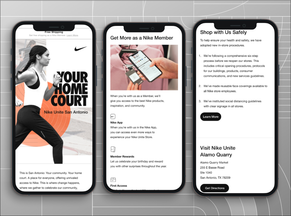
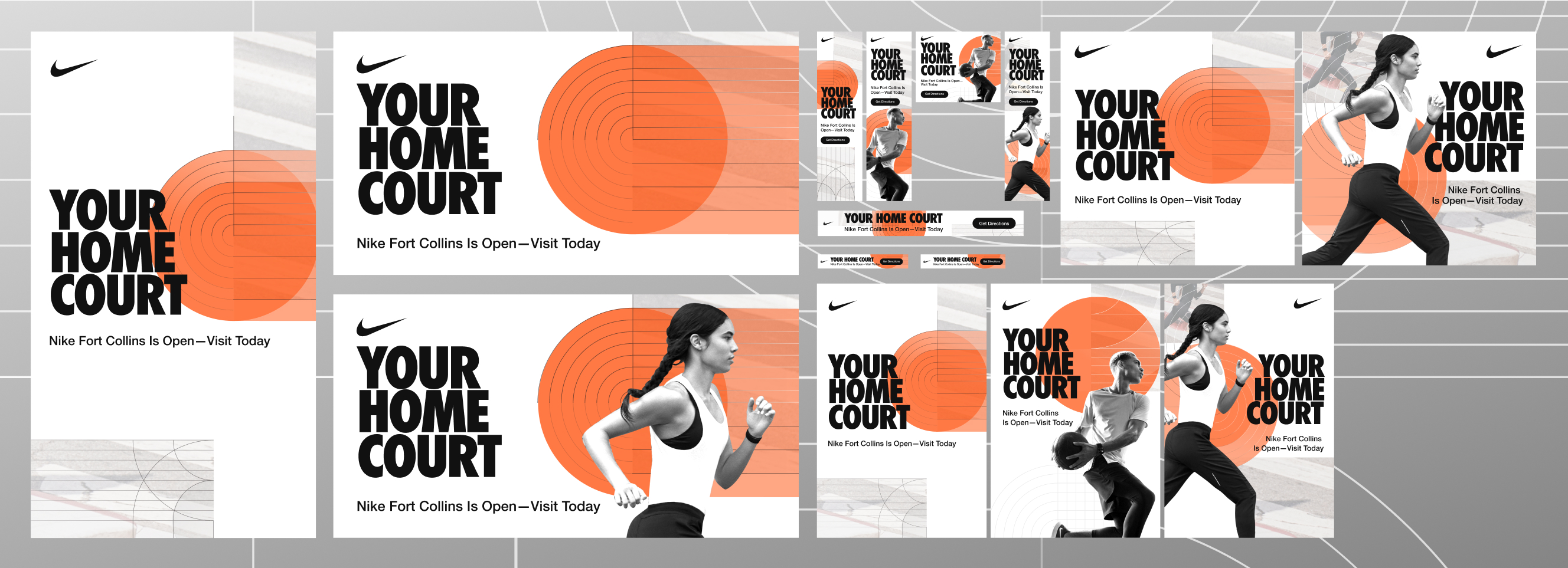
Nike Unite is Nike's reimagining of their factory store concept — a shift from a warehouse experience to something community-forward and locally rooted. Nike led the physical rebrand. I led the creative direction delivering brand guidelines for email, app cards, and paid media that defined how Unite would show up across screens.
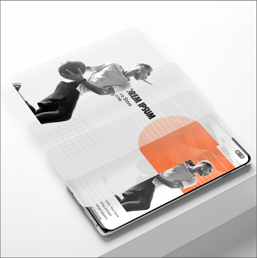
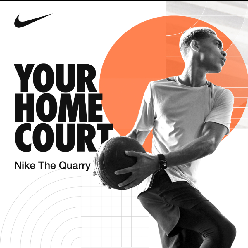
The direction leans on layered brand elements, generous white space, and intentional grid lines that evoke movement — choices designed to translate the airy, community-forward feel of the new stores into surfaces where there's no airiness or community by default.
Challenge
A factory store and a community space feel different in person — different lighting, different spatial pacing, different sense of who the place is for. Most of what made the new Unite identity work in physical space didn't have a direct digital equivalent. There's no airiness on a phone screen. There's no neighborhood feel in a paid media unit.
The challenge was figuring out which qualities of the in-store experience were essential to carry into digital, and which had to be reinvented for surfaces that work fundamentally differently. Layering, color, spacing, and rhythm all had to do the work that physical materials and architecture were doing in the stores — without becoming a literal photograph of the space.
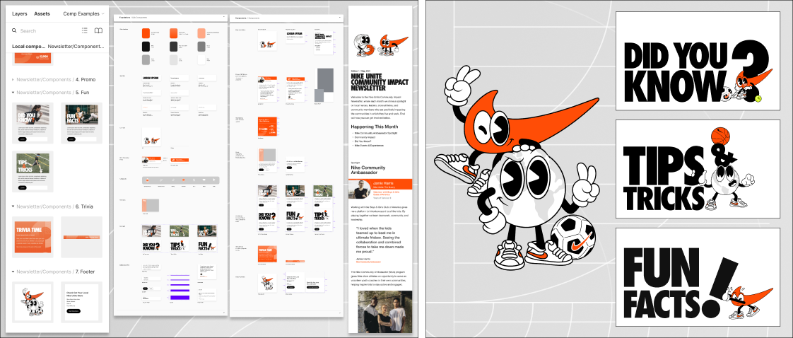
The deliverable wasn't just a set of designs. It was the rules — how to layer, how to create the airy vibe in a digital environment, how to apply color, how to build community-forward composition — so any team producing emails, app cards, or paid media for Unite going forward could match the brand without me in the room.
Role
Design Lead
Graphic Elements
The Nike Unite visual system is built on a grid anchored by foundational units and radial sport lines.
This geometry draws from two distinct sources: the linear geometry of a running track and the urban grid that defines the built environment. Together, they create a system that feels both athletic and grounded in place.
Community Driven
Nike Unite emails bring the store's hometown to life — spotlighting local experiences, community events, and the people behind them.
.gif)