Patreon
Careers Page
Introduction
Patreon's careers subpage had been left behind. After a previous agency ended their contract, the page felt static and disconnected from the rest of Patreon's dynamic, creator-forward brand. There were no job postings, no culture story, and no sense of what it actually meant to work there. As Lead Product Designer, I was brought in to elevate the page — building a cohesive narrative that matched Patreon's energy without overwhelming users.
Challenge
The previous agency had built blades that were dynamic and motion-heavy. The challenge was threading new content into that existing design language without tipping the page into sensory overload. We also had to solve for two user types at once: candidates who wanted to read the culture story, and candidates who just wanted a job. The design needed to serve both without forcing either to sit through the other's experience.
Role
Lead Product Designer
Dual-path navigation built for intent
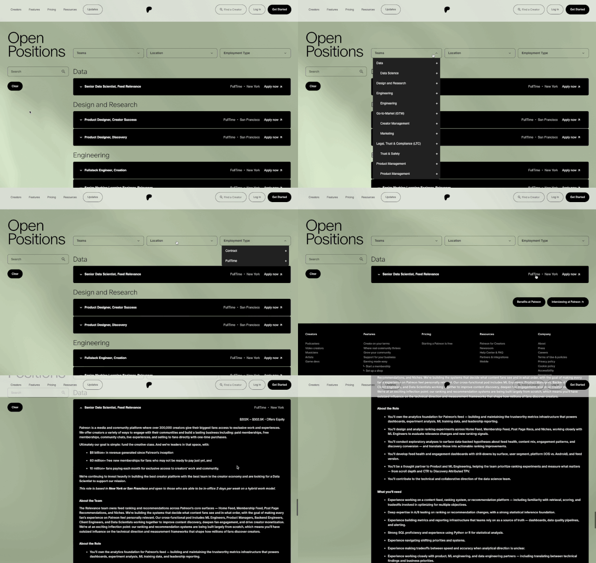
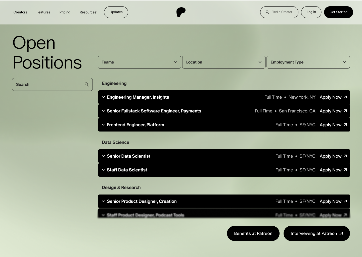
A sticky CTA lets job-focused users jump directly to open postings without scrolling through culture content. At the jobs blade, quick-jump buttons route users back to benefits or forward to Patreon's interview process page. The result is a page that respects user intent — letting candidates self-select the depth they want.

A culture story, not a culture checklist
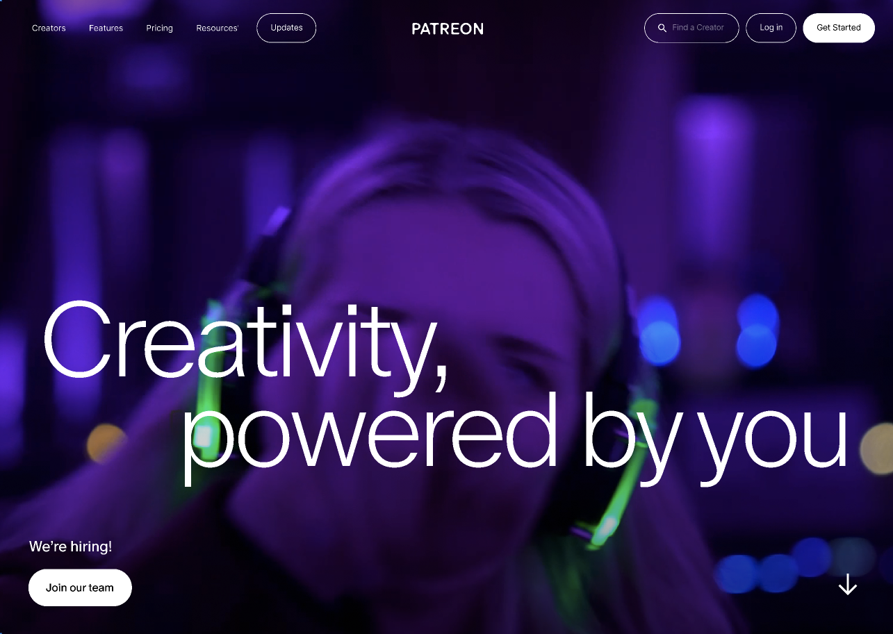
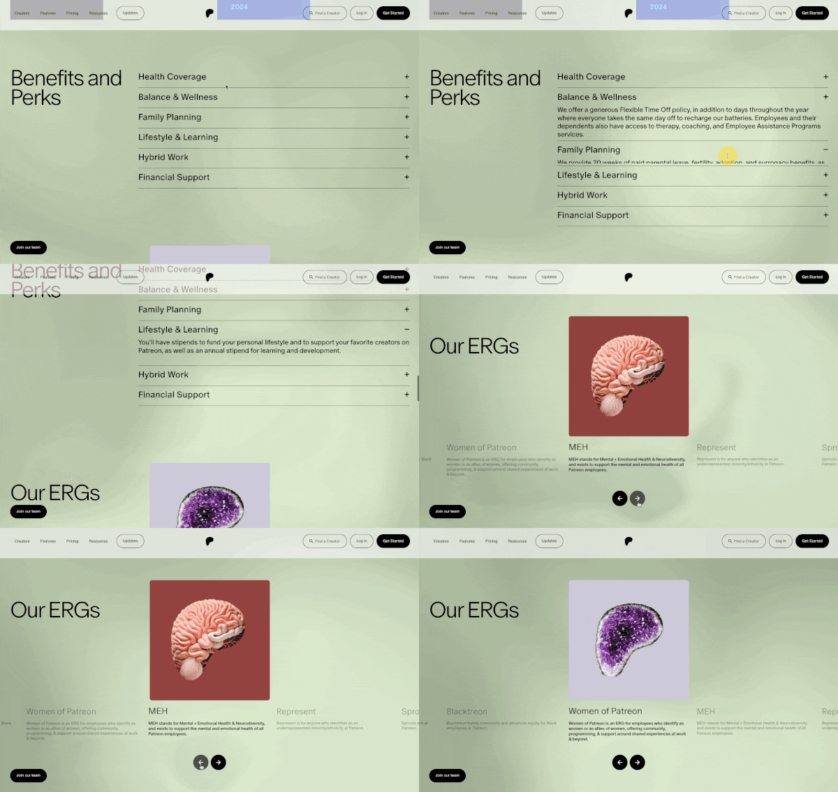
The redesign moved beyond a static "about us" feel into a layered narrative: a dynamic hero, creator empowerment, core values, current news, benefits, ERGs, leadership, and awards. Each blade earned its place by doing a specific job in the story arc — together building a coherent picture of what Patreon stands for and what working there feels like.
Filtering brought onto the page
Rather than handing users off to Ashby to search, the jobs blade kept filtering inside the experience — team, location, employment type, and a general search bar. Candidates could refine before clicking through, reducing friction and keeping them in Patreon's brand environment longer.